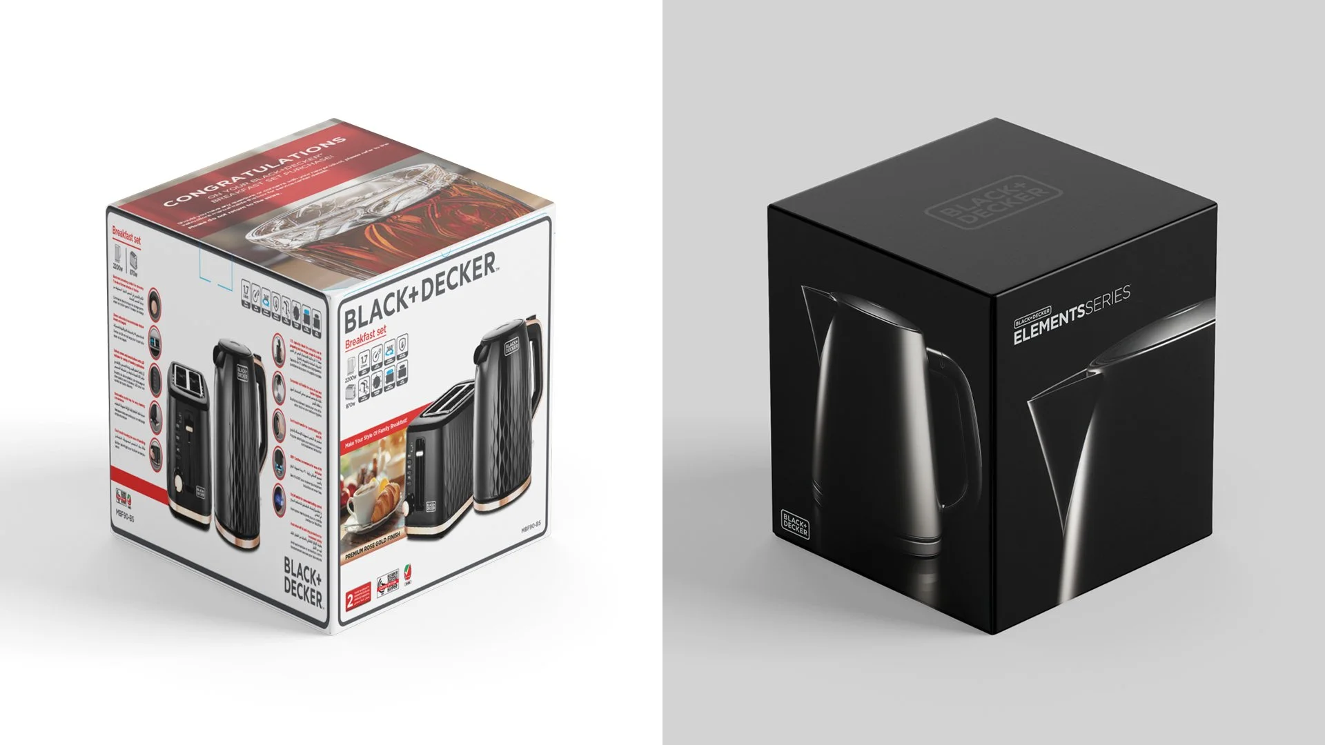

From everyday utility to objects of desire.
—
Animation below
THE OPPORTUNITY
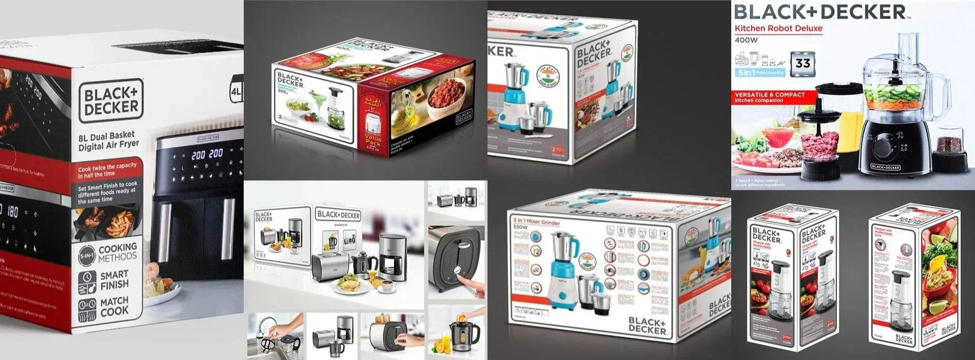
BLACK+DECKER is one of the world's most recognisable household brands. Its established packaging system reflected its positioning: practical, accessible and built around everyday utility.
KNOW Creative were approached to develop packaging for a new stainless steel kitchen appliance range, we saw an opportunity to take the brand somewhere it had never been.
Rather than follow the established global guidelines, we proposed an entirely new creative direction. One that elevated the products from functional appliances into desirable objects designed to complement the modern kitchen.
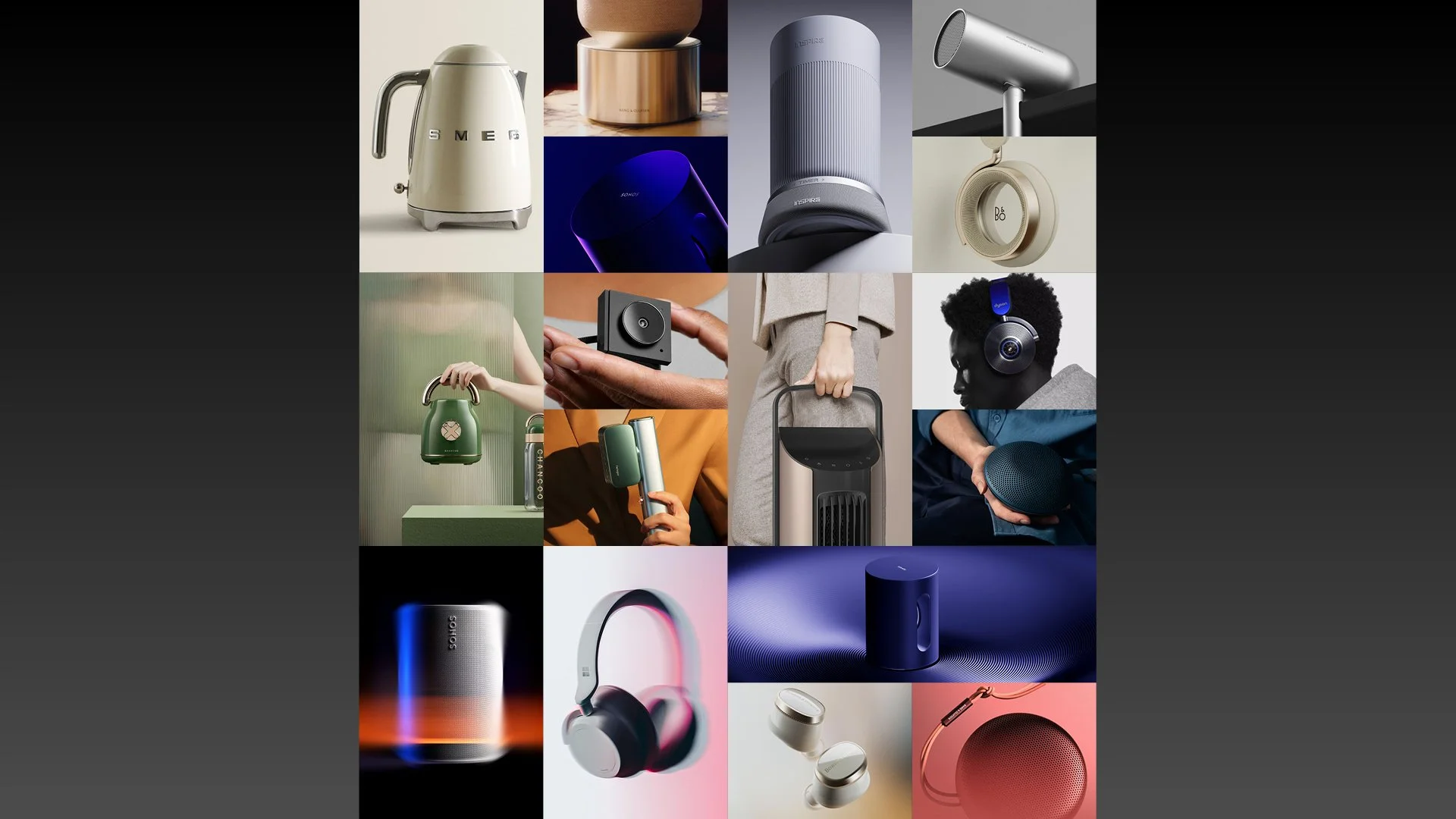
The ambition was simple. Make products people would normally put away into something they would want to leave on display.
THE CREATIVE DIRECTION
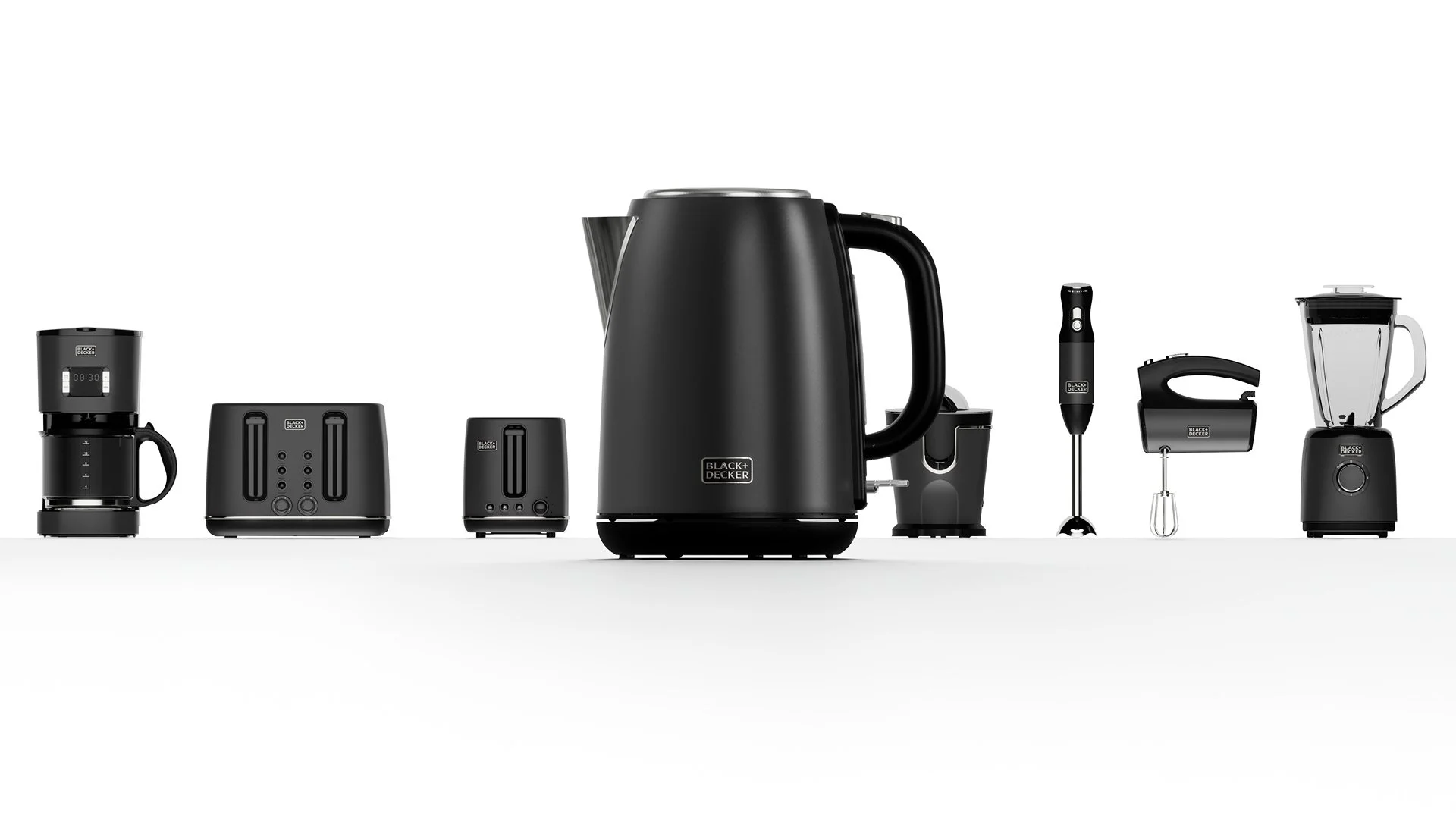
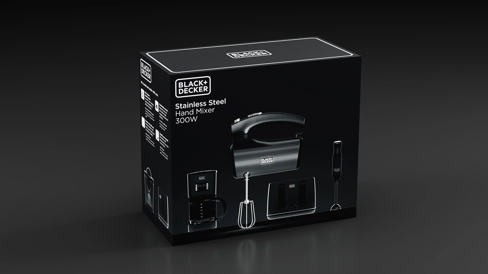
We started with the products themselves. Graphite finishes, brushed aluminium, black surfaces and carefully considered details.
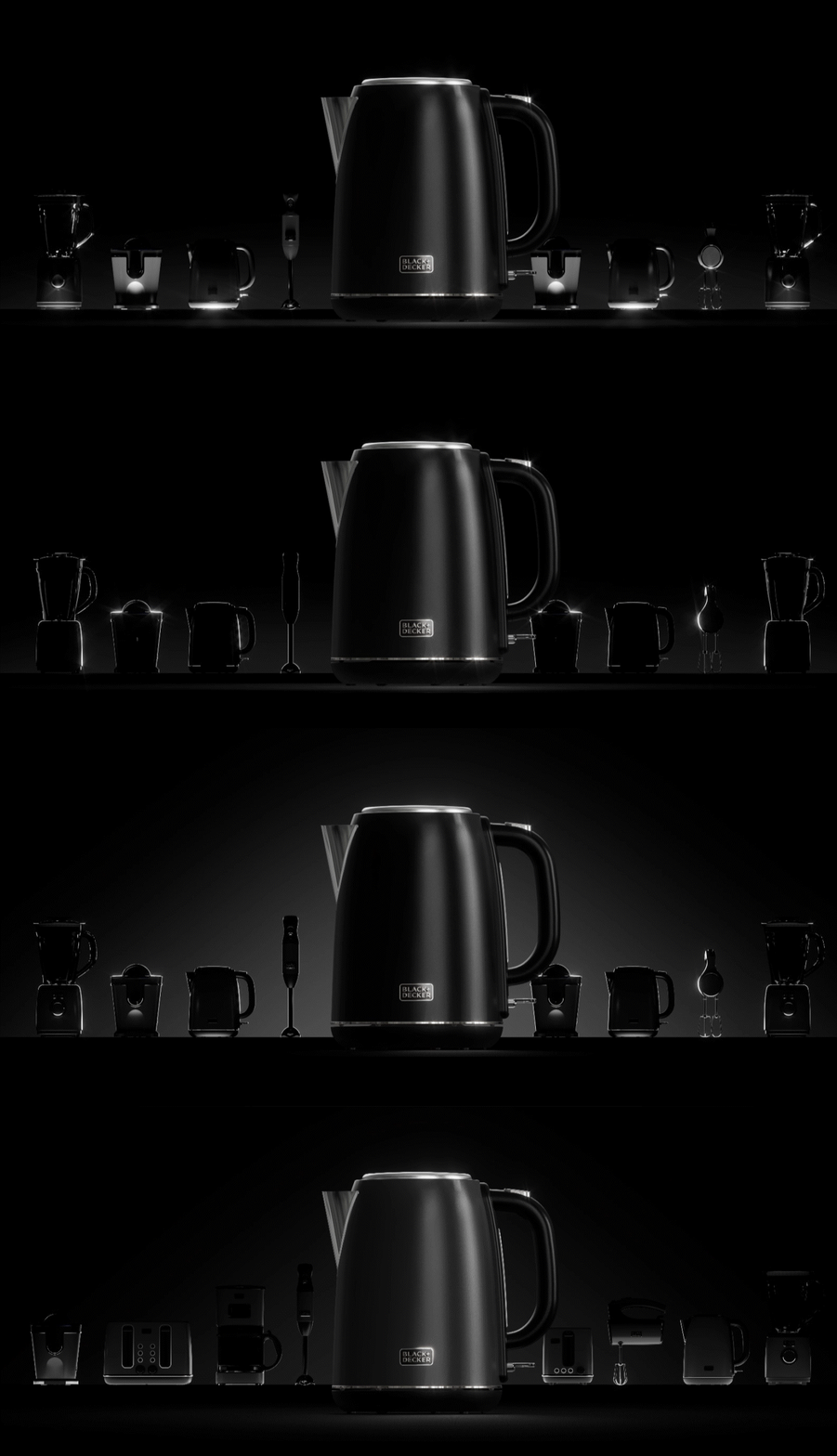
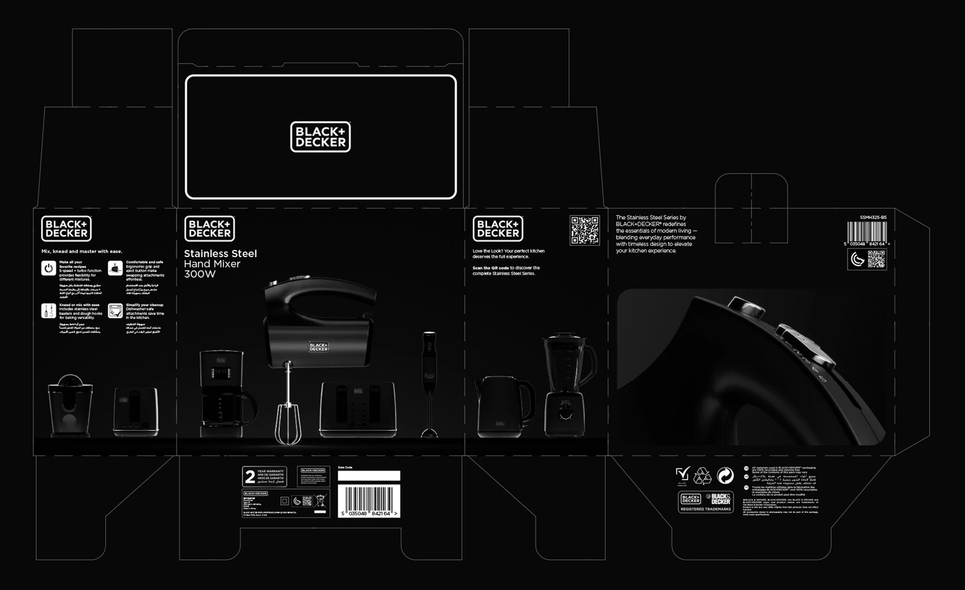
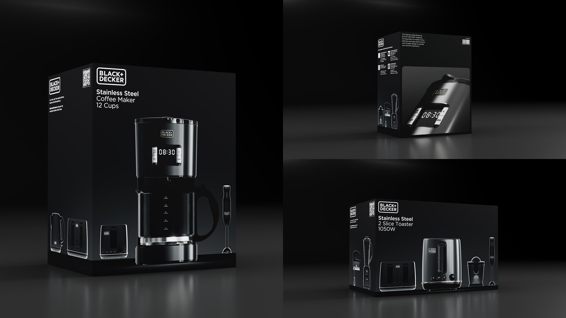
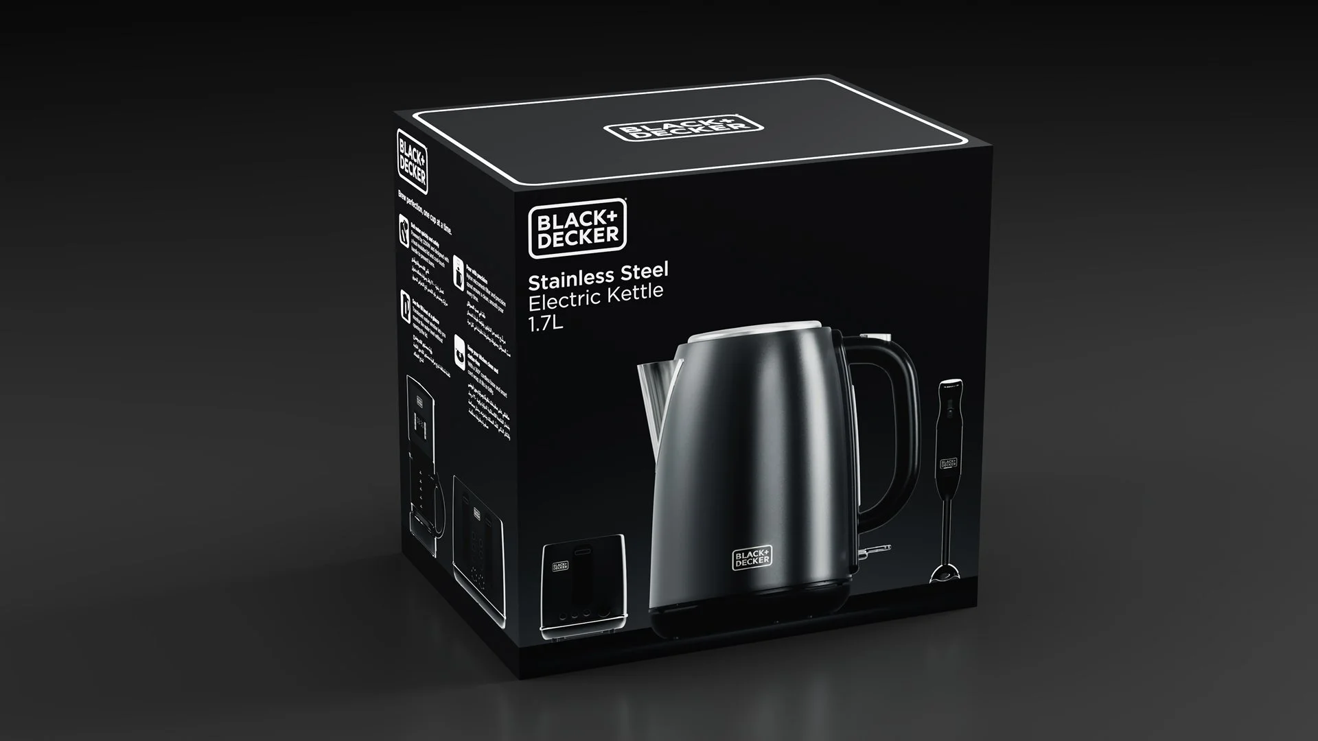
Instead of placing them against the conventional white backgrounds associated with the brand, we inverted the visual language entirely.
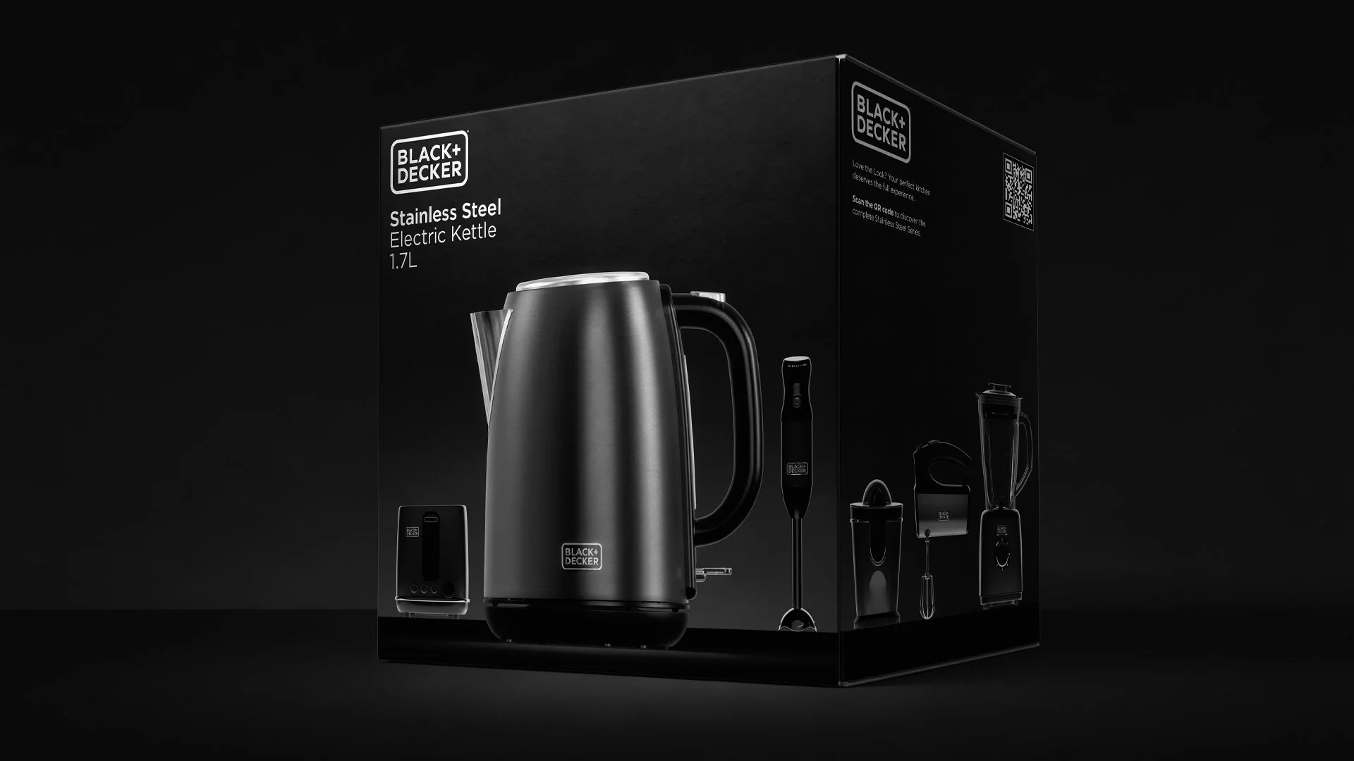
Black on black.
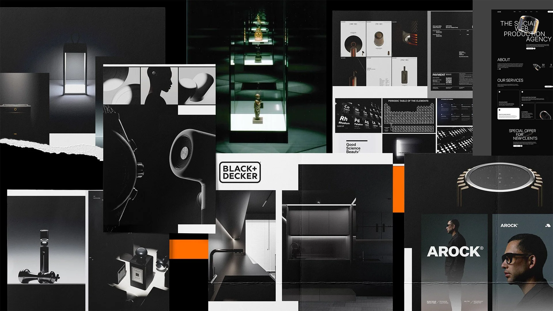
Drawing inspiration from contemporary architecture, museum displays and cinematic lighting, we developed a visual approach that treated each appliance almost as a sculptural object.
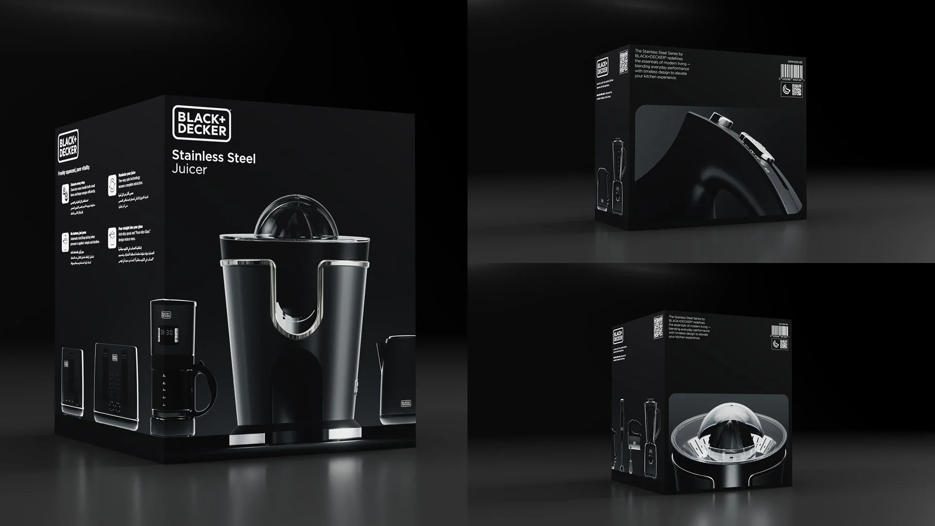
The products would emerge from darkness, illuminated from beneath as though sitting on a lightbox. Light would reveal their form, materials and craftsmanship, while everything unnecessary disappeared into the background.
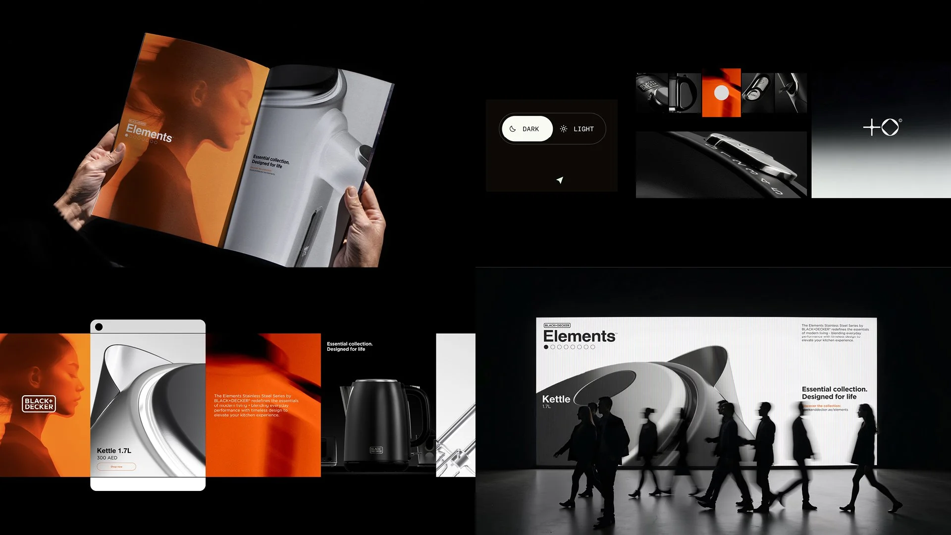
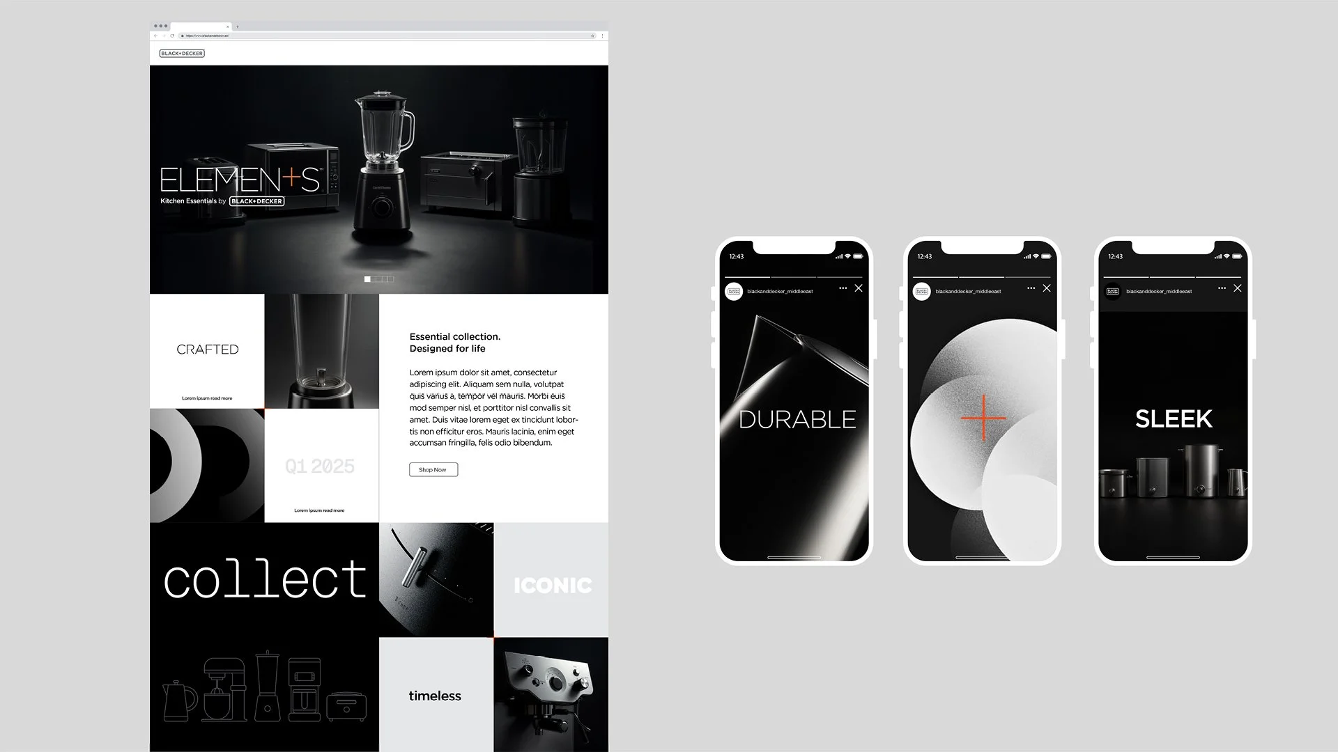
Our original naming concept, Elements, reinforced the idea of a coordinated collection rather than a series of unrelated appliances. Although the final range adopted the more functional Stainless Steel Series name, the creative direction remained.
CREATING EVERYTHING FROM SCRATCH
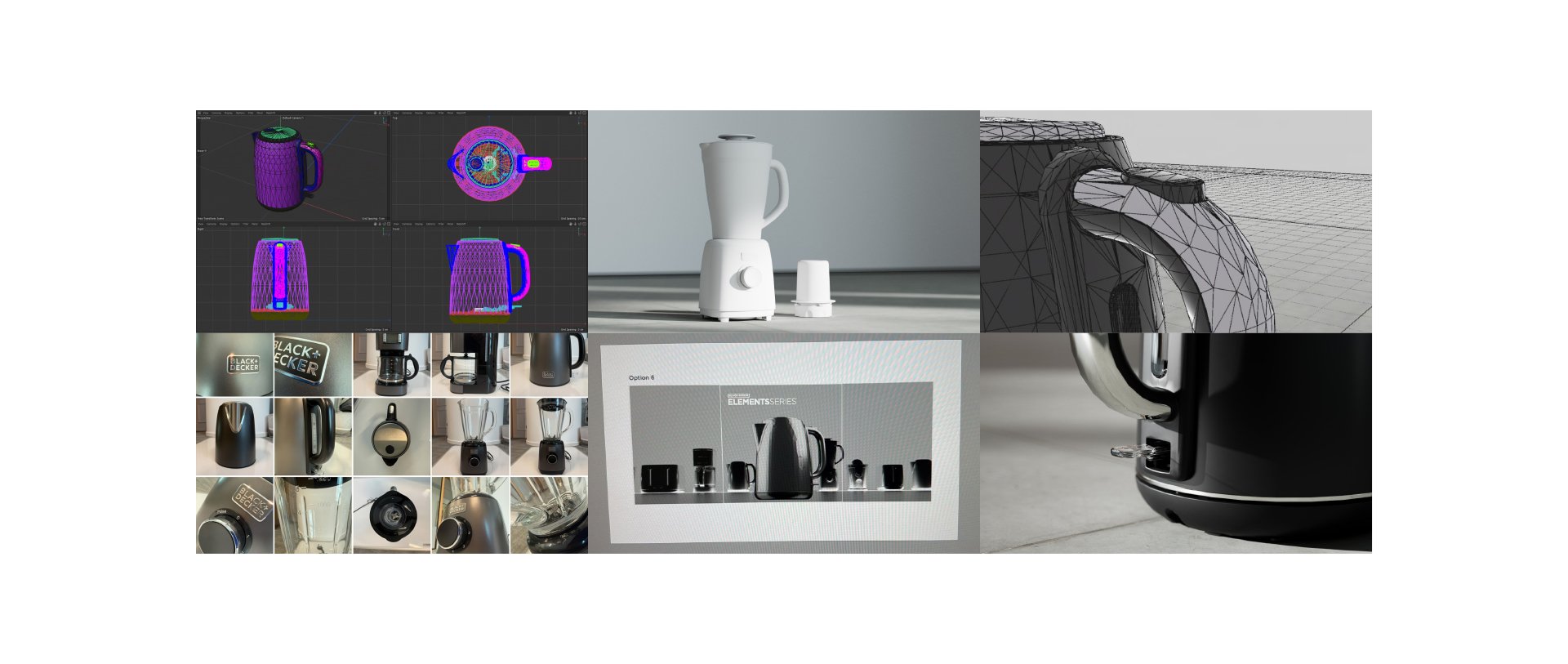
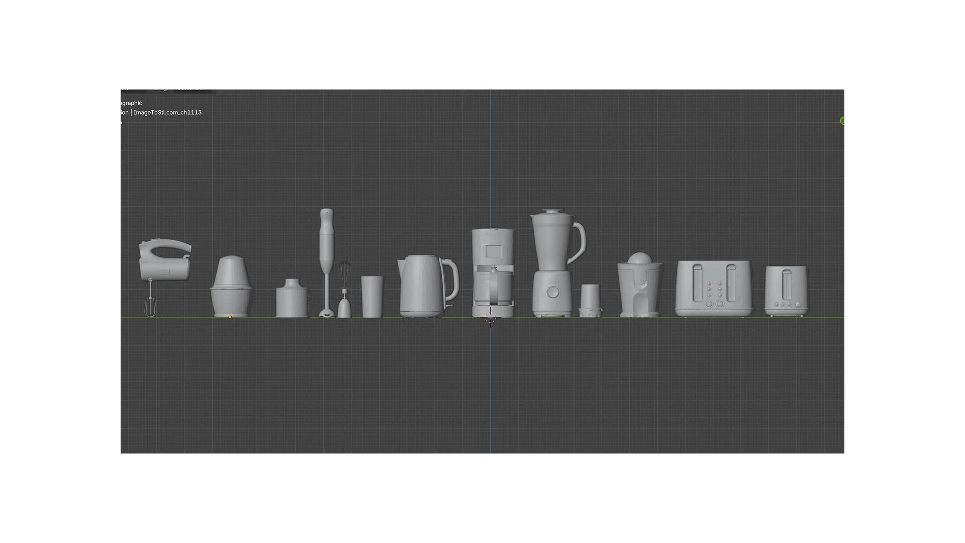
We received the physical products. Nothing else. No existing 3D models, product renders or photography.
To realise the concept, we commissioned Swedish 3D artist Erik Norrhede to build the appliances digitally under our creative direction.
Every product required detailed modelling, material development, lighting exploration and composition. We worked through numerous rounds of research and development to establish a consistent visual treatment that could work across the entire range.
The challenge was balancing two objectives: each appliance needed to feel part of the same collection, while remaining immediately recognisable on its individual packaging.
THE DETAILS MATTER
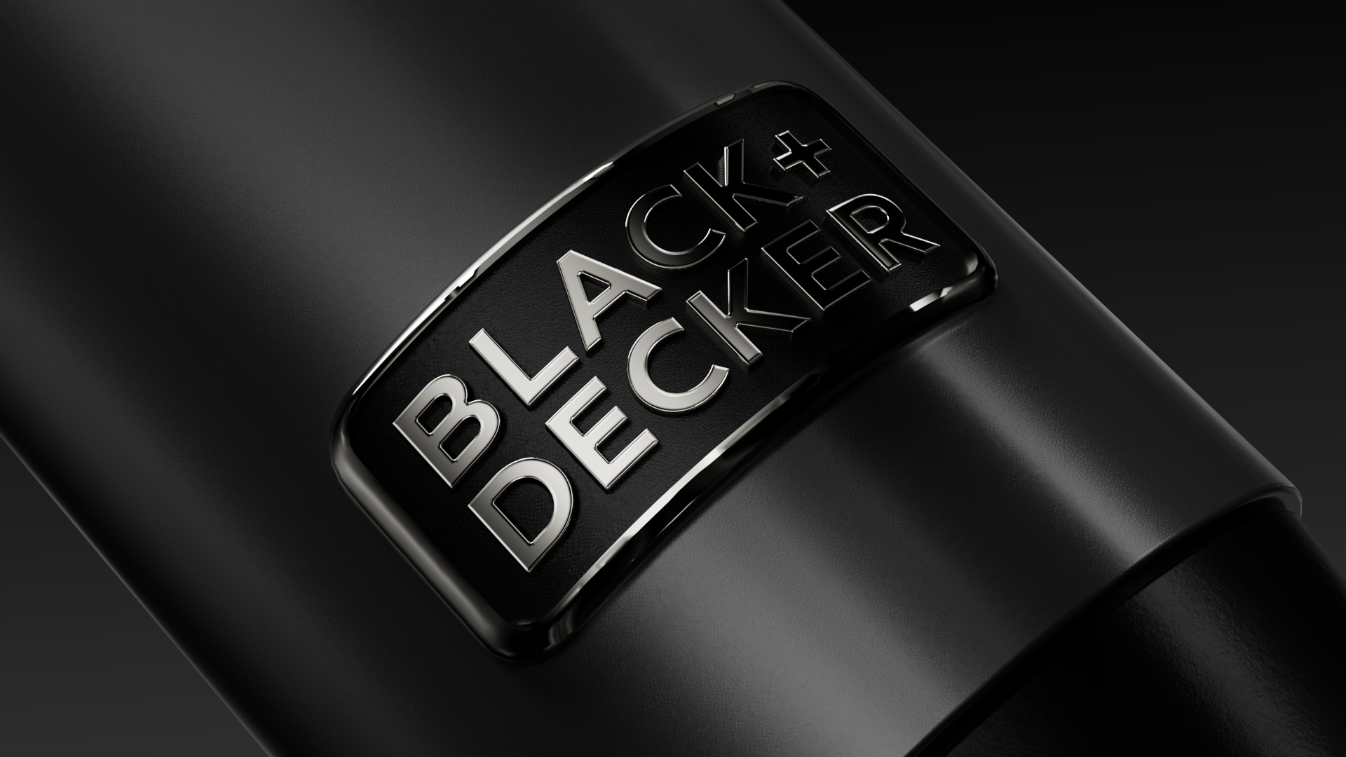
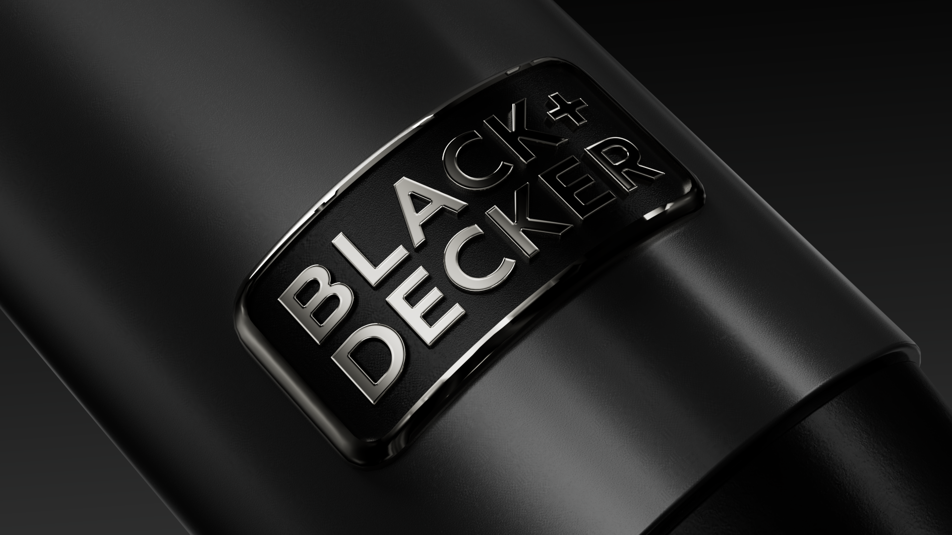
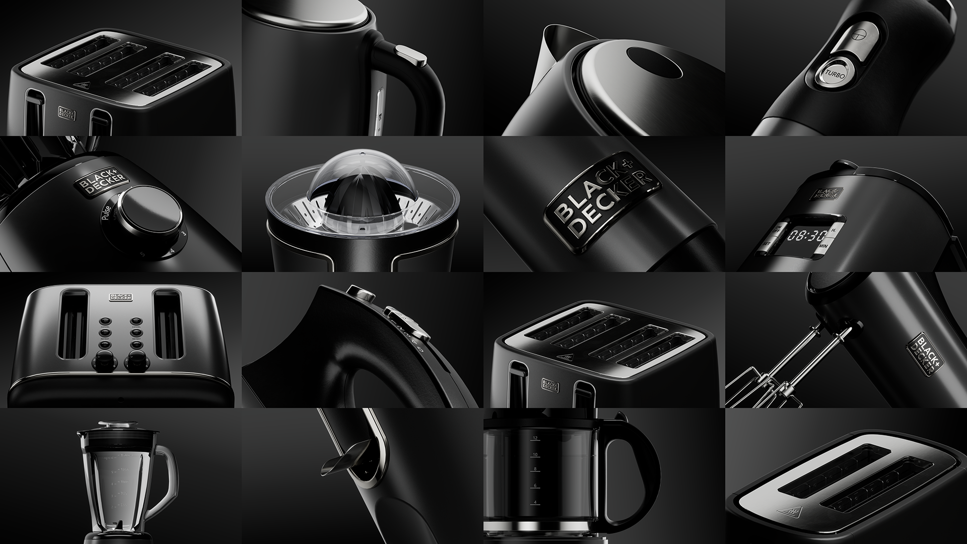
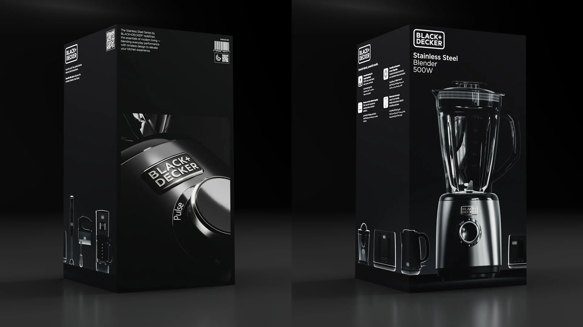
Beyond the hero imagery, we created a series of carefully art-directed product portraits, isolating individual features, materials and finishes.
Through dramatic cropping, controlled reflections and precise lighting, we elevated everyday functional details into distinctive design features. Brushed metal, tactile controls and subtle surface transitions became part of the visual story.
These renders extended the creative language across packaging, sales and marketing, giving the collection a richer, more considered expression.
THE PACKAGING SYSTEM
The challenge was to create a unified collection without losing the individuality of each appliance.
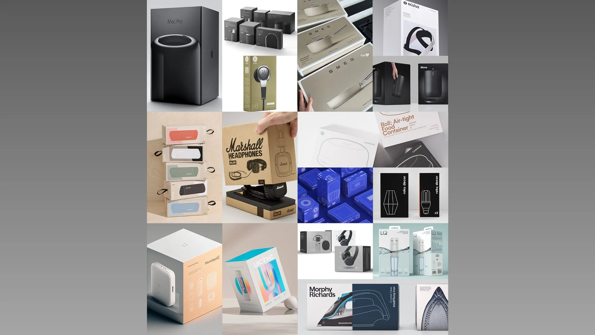
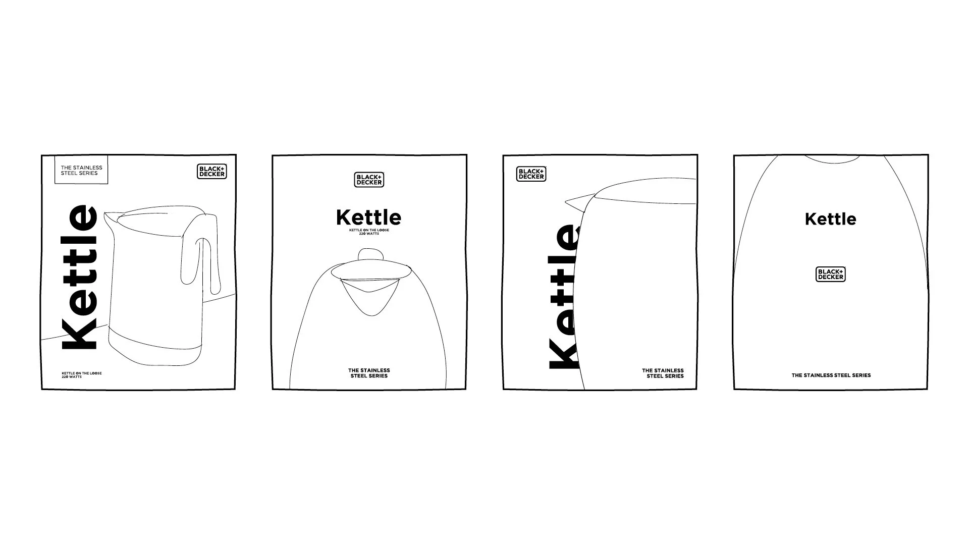
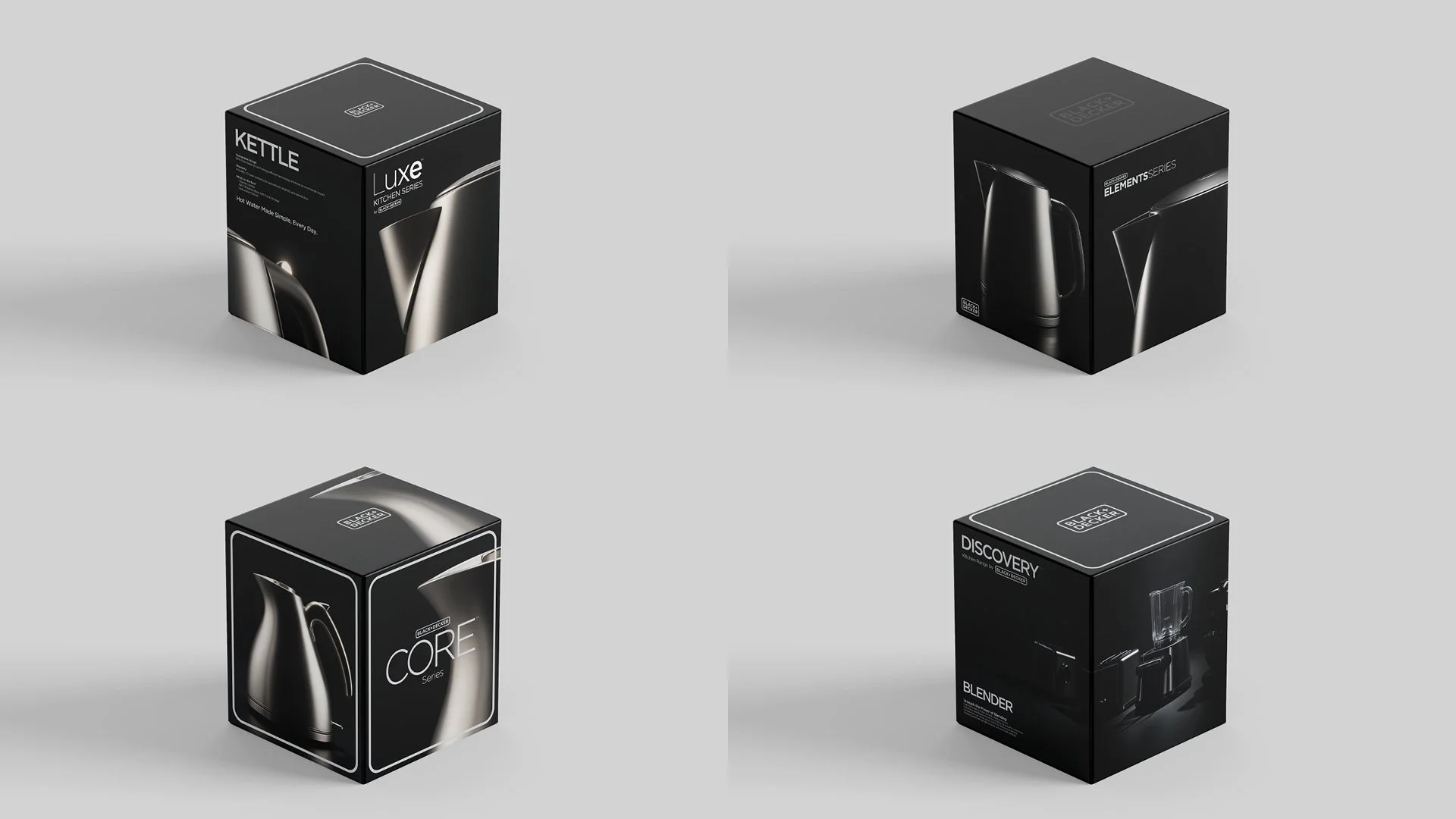
Through consistent composition, scale, lighting and typography, we developed a packaging system that gave every product its own presence while remaining unmistakably part of the same family.
The result was a radical departure from BLACK+DECKER's established global standards. White became black. Utility became desirability.
The result was a packaging range designed to feel as considered as the appliances themselves.
THE OUTCOME
What began as an agency-led creative proposition became a commercially released product range that challenged BLACK+DECKER's established visual conventions.
With the trust of a regional marketing team willing to challenge the rules, we created an entirely new expression for the brand. One that made design and desirability as important as everyday performance.
We weren't asked to reinvent BLACK+DECKER. We saw an opportunity to elevate it.