Material Source — Branding
Material Source is a materials, product, and design destination – online and offline. Celebrating innovation and the people that deliver it – both the individuals, and the companies.
Photography: Tim Ainsworth


A visual identity was needed for presenting their esteemed partner’s work - from a swathe of disciplines and materials, from minimalism to maximalism and everything in between.

A responsive, hyper-functional kit-of-parts that created structure in any format, on any platform. Enabling layouts and hierarchy to be formed nimbly and efficiently, whilst allowing the individual product exhibitions to really shine.


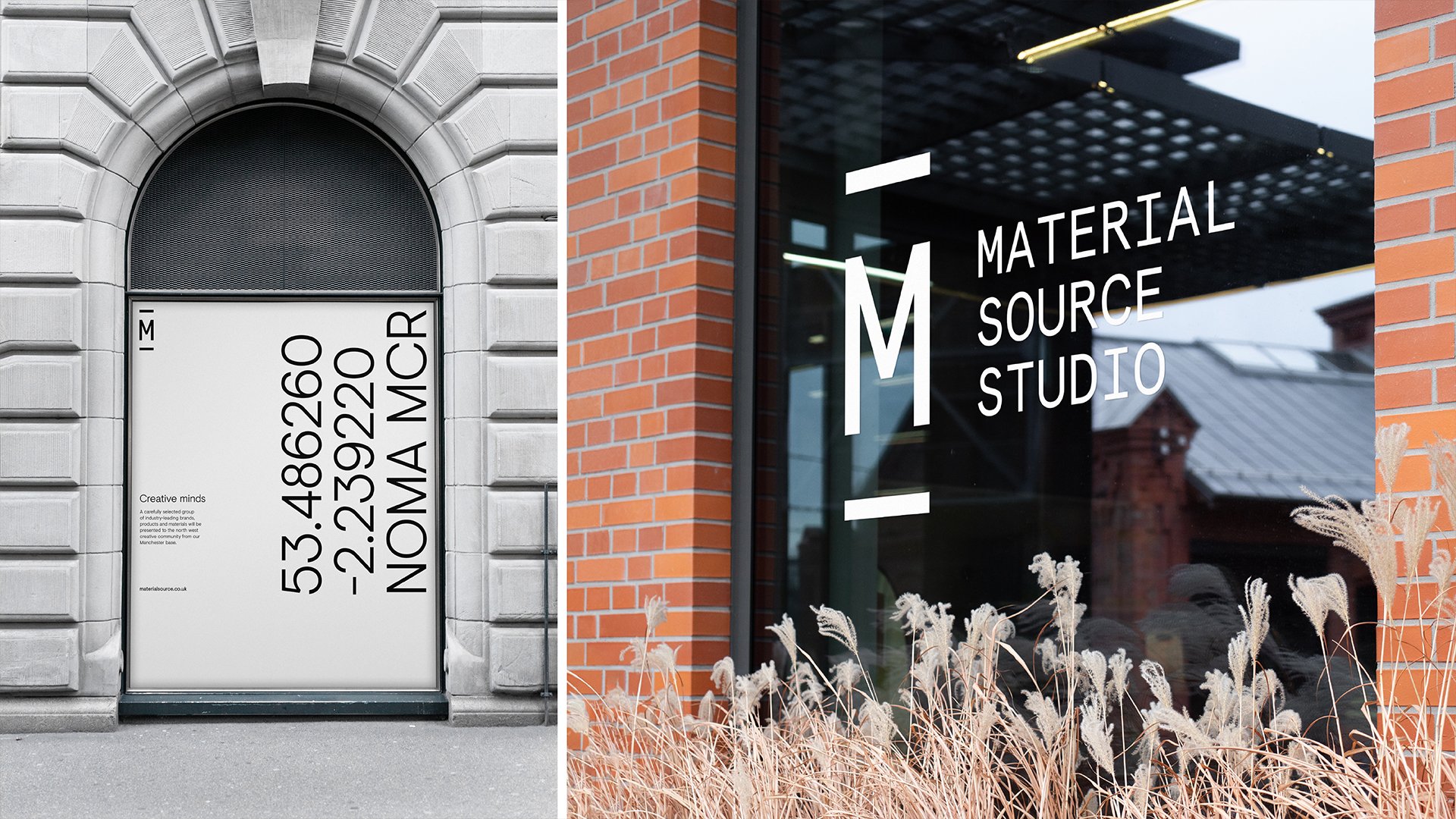
Hierarchical typography for the main headlines was a considered part of the Material Source Studio identity system, where the address line has parity with the content, and is featured prominently. This was purposely intended to create a physical connection between their studios and the community they occupy, alongside promoting each district as the destination - at every opportunity. In this illustration: NOMA Manchester.


We also created and developed their digital and social media visual assets, to continue to engage their loyal audience of over 40,000 - comprising of architects, designers, builders, specifiers, facilities managers and end-users from around the world.


